Carousels Designed For @unq_ai

Free vs Paid AI Tools
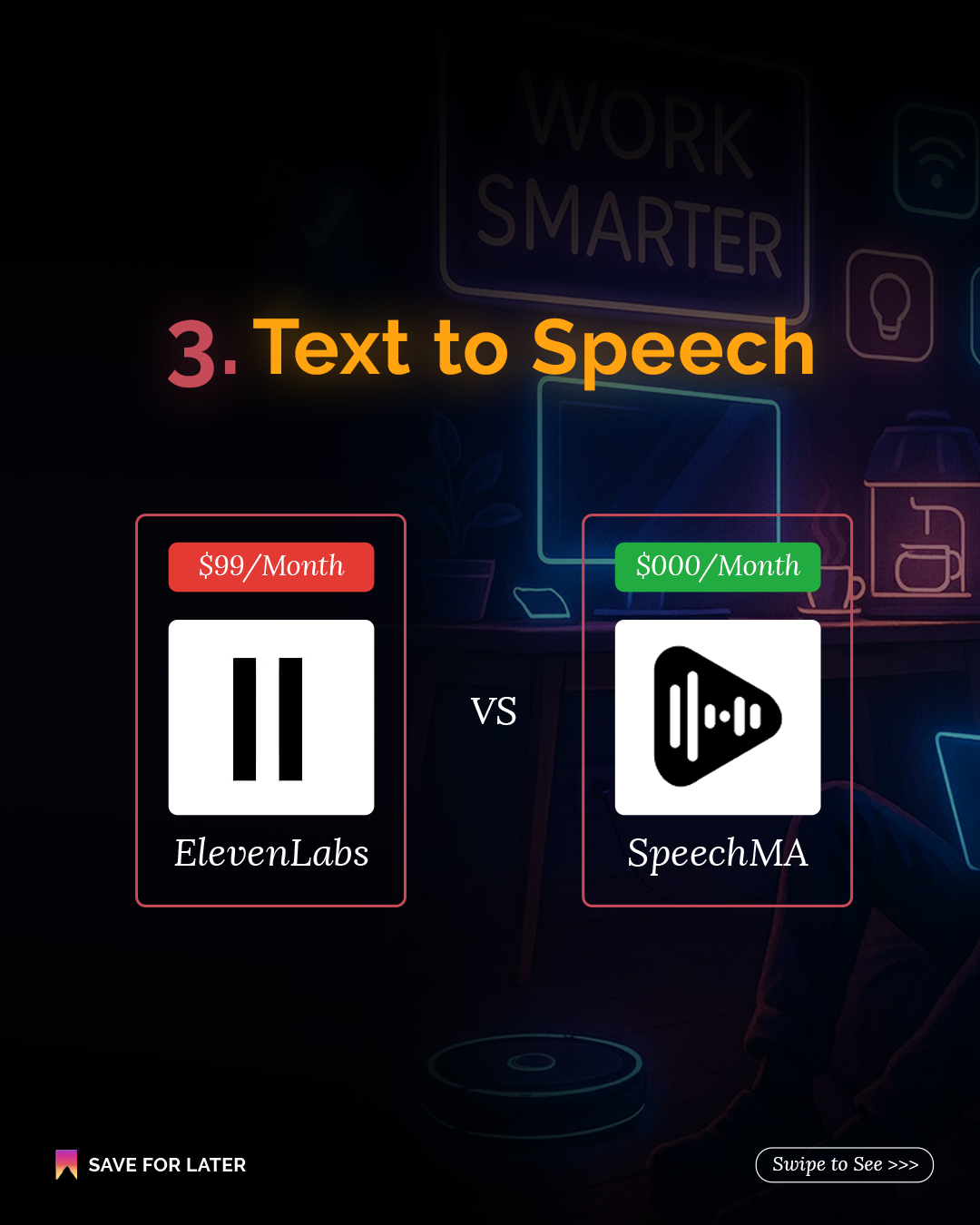
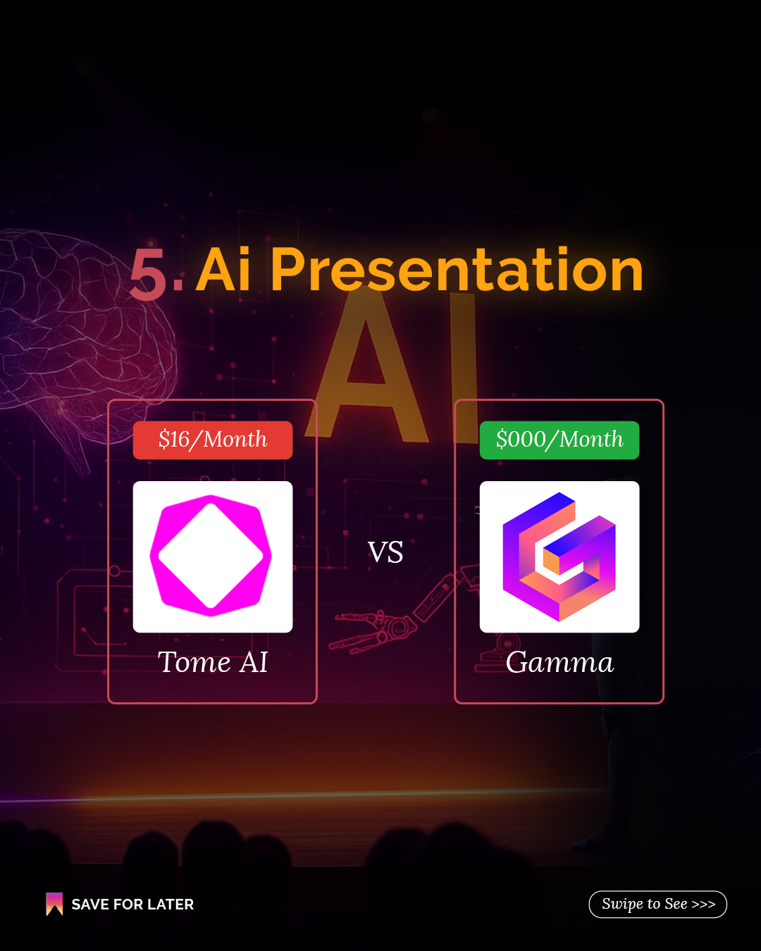
An 8 slide carousel comparing free AI tools to their paid versions. Research, image gen, voice cloning, video, automation. A cyberpunk hook slide earns the stop, then a color coded template (red for paid, green for free) does the rest. No caption needed.




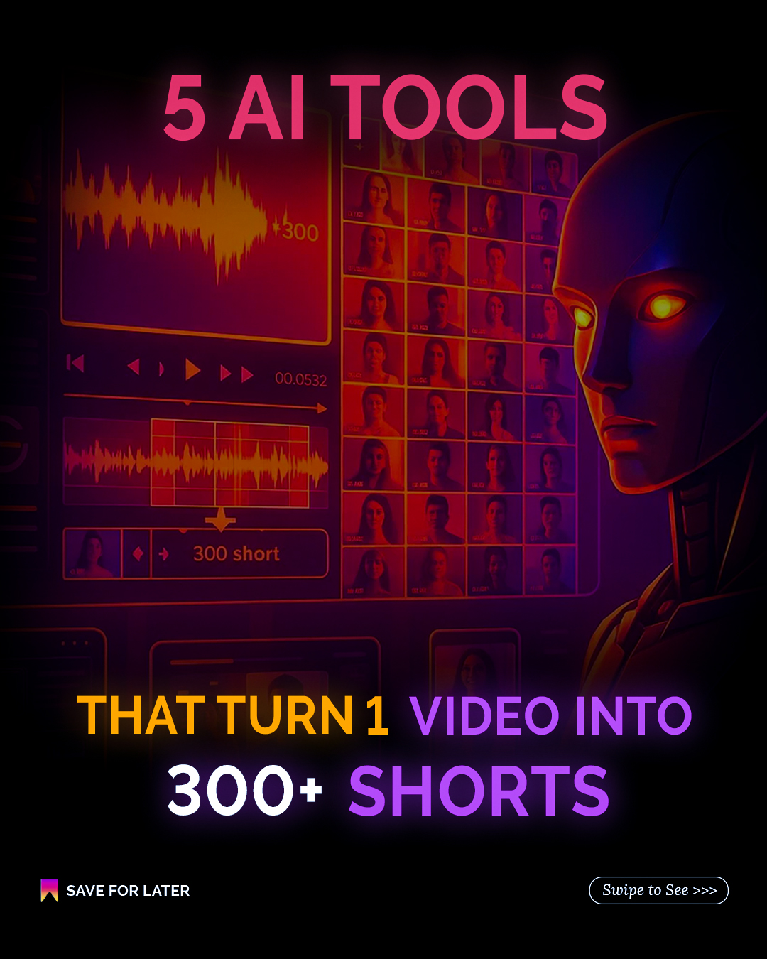
5 AI Tools, 1 Video Into 300+ Shorts
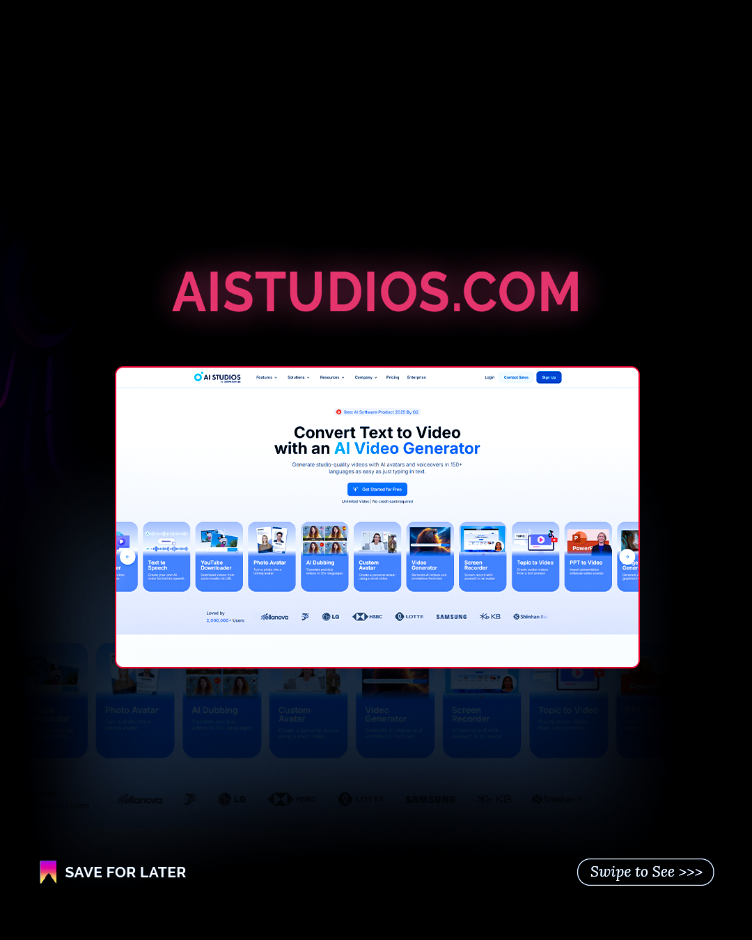
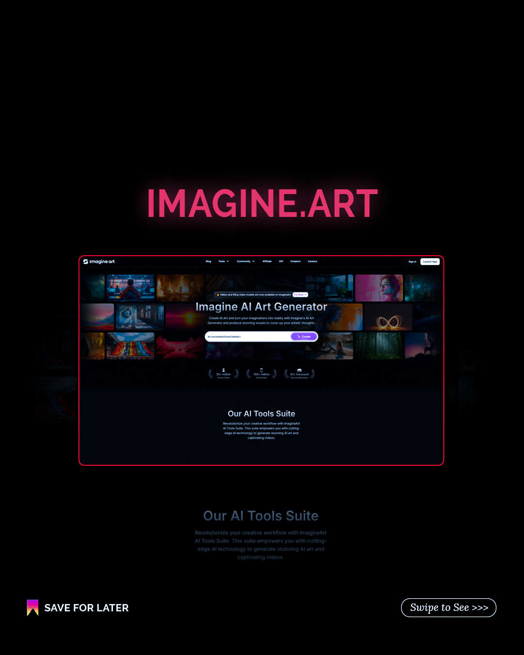
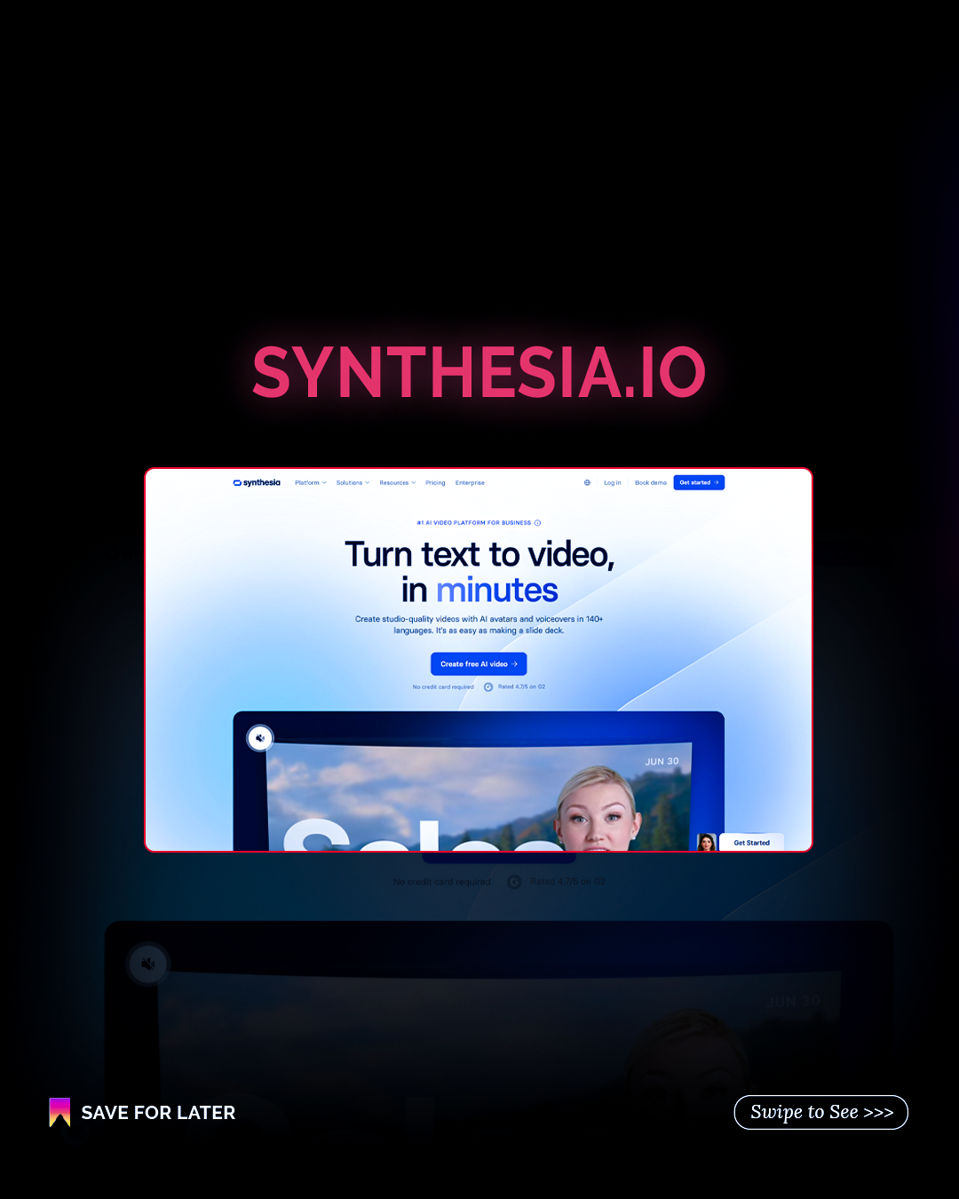
A tool showcase carousel led by a bold number hook. Each slide spotlights a real tool (AI Studios, FlexClip, Pictory, Imagine.art, Synthesia) in a clean glow framed screenshot style. Closes with the brand's signature CTA outro.



Free vs Paid, The AI Tools Directory
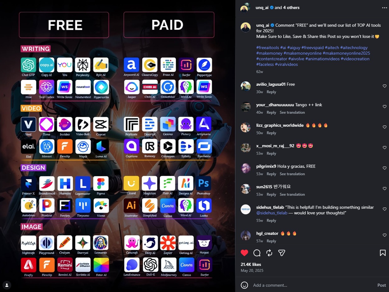
A single dense post mapping free vs paid AI tools across Writing, Video, Design, and Image, built as a save first, share first reference sheet for AI creators. Clear category tags, a clean two column grid, and real tool logos so people recognize what they already use. This is the post that pulled 21.4K likes.
All posts share the same DNA. Same pink, purple, orange neon palette. Same "Save for Later" and "Swipe to See" prompts. Same closing slide style. That's what makes it feel like one content system, not a bunch of random posts.